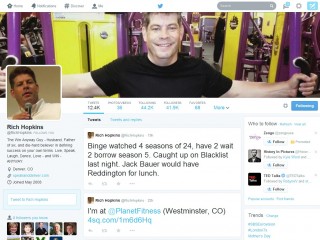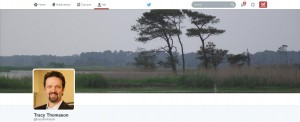
Twitter's got a new look and, I'll be frank, it's about damn time. OK, OK, I know Twitter is all about the tweets and not so much a about snazzy graphics, but the old layout was just awkward. You had your thumbnail size profile photo, your decent sized header image, and your somewhat useless background image that sometimes showed correctly and sometimes didn't. The new layout is, dare I compare them, similar to Facebook and I like it!
The three image-related changes are that the header image is now huge -- the full width of the page. Your profile photo will also be much larger. Yes, someone can actually tell what you look like now. And that awkward background image -- well, it's gone.
Several content display changes are in store for you, too. Just a few are Pinned Tweets, Best Tweets, and Filtered Tweets. But more on this later.
 To get started with your update, log into your Twitter account and go to your profile page. At the top of the page you'll see a block suggesting that you try out the new layout. Click the Take a Look button and get started.
Twitter's New Image Sizes
The header image, similar to Facebook's Cover Photo, is short and wide. The recommended dimensions of the new header image are 1500 pixels wide by 500 pixels tall. However, the real dimensions seem to be more like 1500 x 421. Twitter cropped a little off the top of my images. Smaller images can be used, of course, but they will be stretched to fill those dimensions.
Twitter recommends 400 pixels by 400 pixels for your profile photo. Mine seems to display at 200 x 200, though. However, if someone clicks on your image, the full 400 x 400 version will be displayed.
The profile photo is no problem. Square photos are easy. I just don't seem to take pictures that crop into the 3 to 1 ratio that the header image requires. However, after seeing the Twitter header of my friend Rich Hopkins (screen captured and is the image at the top of this post,) I'm inspired and will start looking for opportunities to capture great images like his. Mine just won't be at the gym. I can't smile like that when I'm working out.
Twitter's New Layout Features
Best Tweets: Sometimes only your mom retweets your stuff (thanks mom!) And sometimes the whole world does (for me that means mom retweets from both of her accounts.) Anyway, your best tweets, those that receive the most engagement (based on retweets, favorites, and replied to,) will appear slightly larger in your profile page so that your best content stands out.
Pinned Tweet: You know those days when you're extra witty? Yeah, me neither. But if you do have one and you tweet something awesome/hilarious/astute, you can pin it to the top of your page so it's easy to find.
Filtered Tweets: When viewing others' feeds, you can filter their content so that you only see all their tweets, just tweets with photos/videos, tweets with replies, or tweets that have been favorited. As of now, there is not an awesome/hilarious/astute filter.
Several other tweaks have been made including a change to a 3-column layout, floating tabs beneath header photos (instead of the links in the top left,) and a rearrangement of the bio information (which now includes the year the person joined Twitter.)
The Quick Takeaway
Twitter's new layout is much more attractive than it was previously and the layout changes are easy to make. Jump in, adopt the new profile, and have a little fun. Send me a direct message when you're done so I can see your new page.
